Octopian Digital Platform Branding
The Project
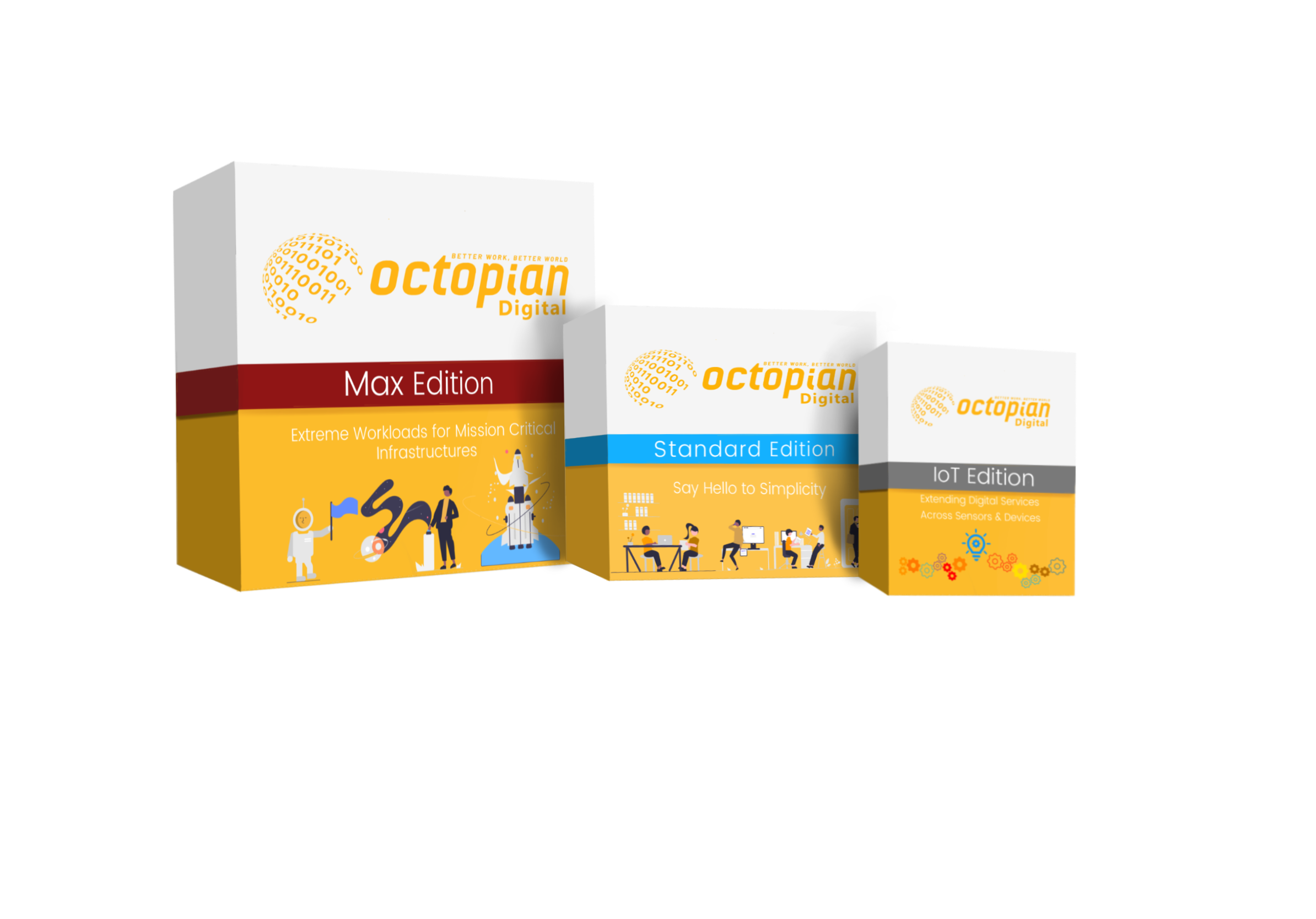
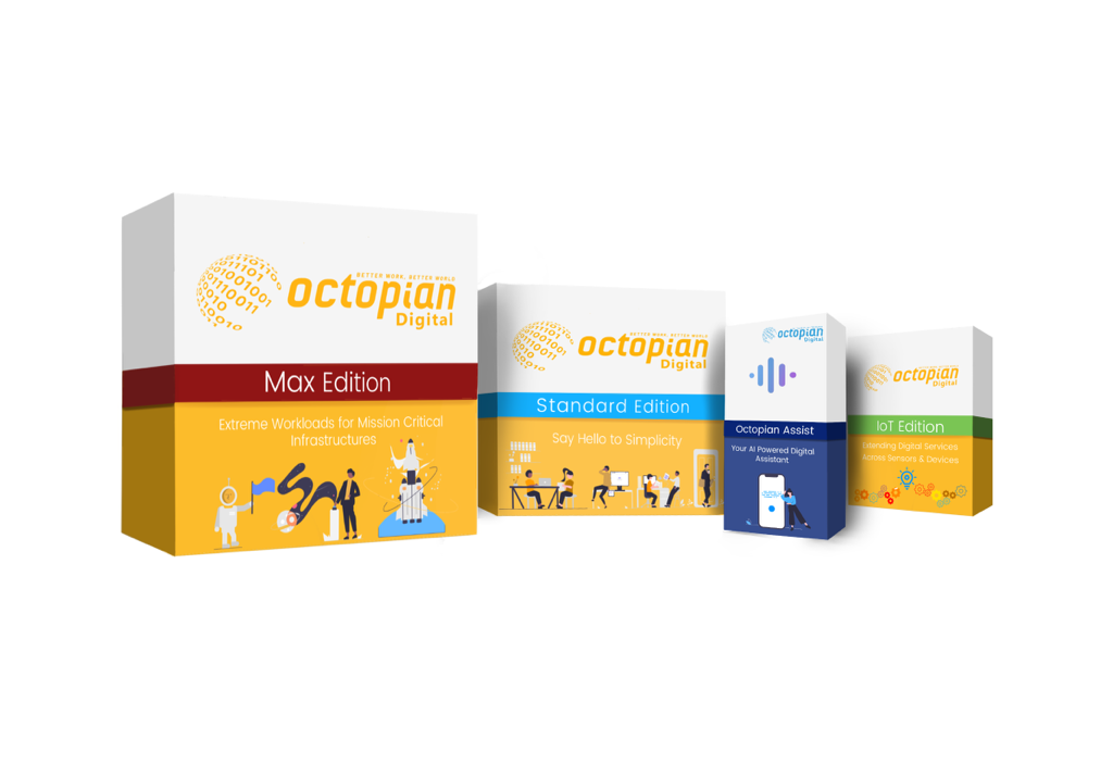
The project involved designing visual aids to denote each version of Octopian Digital's platform, 'Octopian Cloud.' The aim was to create distinct branding elements for the Standard, Max, and IoT editions, ensuring clarity and differentiation between the various versions of the platform. In addition, we needed some sort of visual aid for Octopian Assist, the AI assistant that was being offered along with each version of the platform.
The Process
The design process began with conceptualizing the visual identity for each edition, considering factors such as target audience and branding guidelines. I developed unique box designs for the Standard, Max, and IoT editions & Octopian Assist, aiming to create distinct branding elements that would ensure clarity and differentiation between the various versions of the platform. Iterative design iterations were conducted to refine the box designs, with close collaboration with stakeholders ensuring alignment with Octopian Digital's brand values and objectives.
The Execution
The execution involved incorporating the designed box images into the online 'app store' interface for Octopian Cloud. These boxes served as visual indicators for users to select their desired edition when placing orders for automation solutions. By leveraging the distinct branding elements of the boxes, users could easily identify and select the appropriate platform edition, and further customize their orders to meet their specific needs. This intuitive interface streamlined the ordering process for clients, while enhancing the platform's visual branding and marketing efforts.


